More Health and Nutrition Bites
Related
Calories vs. Minutes
If you live in the United States, there's a good chance that you've already seen calorie information listed on a restaurant menu. The state of California and both Philadelphia and New York City already require it, and many restaurants are already doing it voluntarily. If you haven't yet, don't worry: the 2010 Patient Protection and Affordable Healthcare Act requires it for all restaurants.
It's the calories, not the names
Researchers at the University of Scranton, Pennsylvania wondered if there were a relationship between stereotypes about how fattening a food is and that food's actual nutrient content (Appetite 2006;46(2): 224-233).
Sodium Claims on Food Labels
Since you're a Dr. Gourmet reader, you're probably well aware of the relationship between high sodium intake and the increased risk of high blood pressure and heart disease. Because processed foods are the largest source of sodium in a Western diet, many countries allow specific health claims related to sodium to be listed on a food's label in addition to the sodium information listed in the Nutrition Facts.
Health & Nutrition Bites
Get the latest health and diet news - along with what you can do about it - sent to your Inbox once a week. Get Dr. Gourmet's Health and Nutrition Bites sent to you via email. Sign up now!
Red Light / Green Light

Earlier this year I reported on a study that looked at different ways to present nutrition information on a menu in order to affect the number of calories a person ordered. That study compared displaying the number of minutes walking it would take to burn the calories in each item with the number of miles one would have to walk. The menu presenting calorie numbers along with miles of walking appeared to have the most effect, leading those who selected their meal from that menu presentation to choose 20% fewer calories.
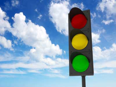
Researchers in Australia recently assessed an even simpler way to present calorie information: using traffic light imagery (Appetite 2013;67:8-15). Almost 1,300 adults responded to an online survey asking them to imagine they were choosing their evening meal from a sample fast food menu. The participants were randomly assigned to choose from one of five menus, all presenting the same food items but differing in the additional information displayed alongside:
1. No additional labeling (the control);
2. Number of calories;
3. Number of calories plus the percentage of recommended daily calories the food contained (based on a 2000 calorie diet);
4. Number of calories plus traffic light labeling (more on that in a moment);
5. Number of calories plus percentage of recommended daily calories plus traffic light labeling.
For the traffic light labeling, the researchers used the United Kingdom Food Standards Agency criteria, which assesses foods based on fat, salt, and sugar content per serving. A red light shown next to a food was labeled "Least healthy choice," a yellow light was labeled "OK choice," and a green light was labeled "Healthier choice."
As you might expect from the results of the previous study, those who chose from the menu with no additional labeling chose the highest number of calories. Those who chose from either the calories only labeling or the calories plus traffic light labeling chose about 11% fewer calories. Interestingly, the researchers report "no significant difference" between those who chose from the menu with no additional labeling and those whose menu labels included the percentage of recommended daily calories - even when that percentage label was accompanied by the traffic light labeling.
After making their virtual meal selections, the participants were asked what information, of those presented to them, they used to make their decisions. Over one-third, or 36%, of those who saw the traffic light labels made use of them to inform their decision, while 25% used calorie information and only 20% paid attention to percentage of daily intake.
Of those 259 people who were presented with all three additional pieces of information, 38% identified the traffic lights as the guide they used to make their decision. Only 20% used calorie numbers, and even fewer - 15% paid attention to percent of daily intake.
What this means for you
It would seem that the participants in this study found it easier to make decisions based on a simple symbol rather than numbers like percentage of daily intake or number of calories. It does make sense, however, when you realize that comparatively few people are aware of their caloric needs. The important thing is that you, dear readers, make use of whatever nutrition information is available to you when you eat out - whether it's at a fast food restaurant, chain restaurant, or a "white tablecloth" restaurant.
First posted: May 22, 2013
